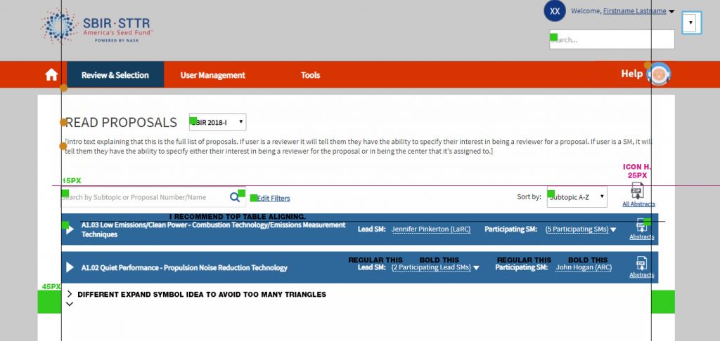
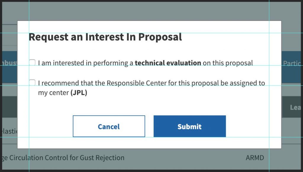
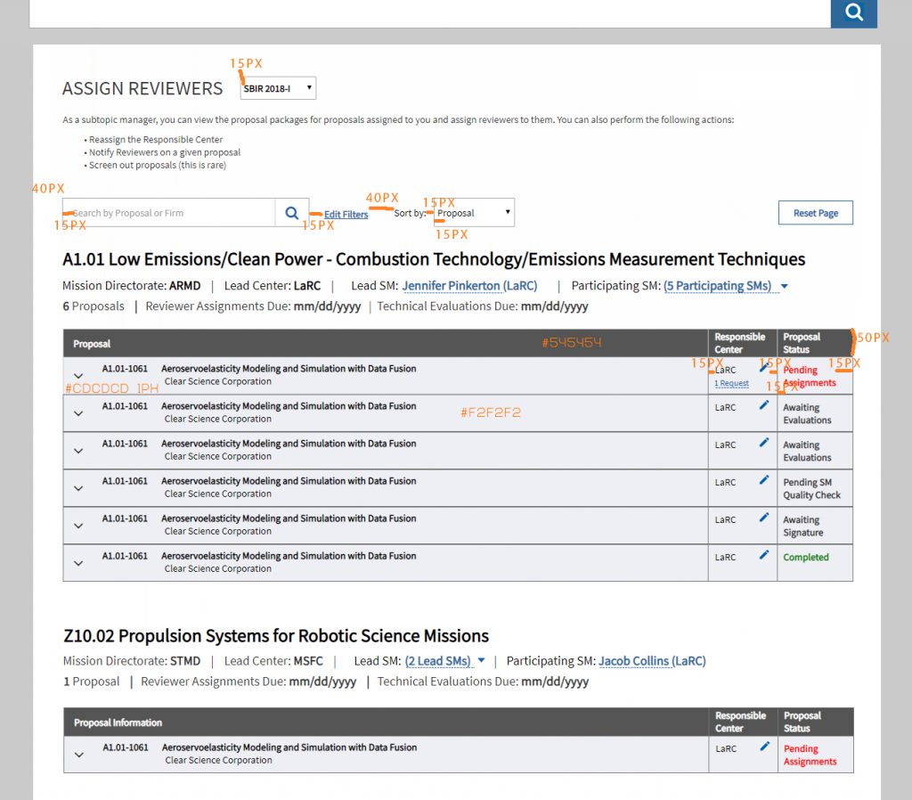
Over the last several months I have participated in the interface redesign project for the NASA SBIR Grants System. The initial request from the client was to simply give the portal a visual redesign, but as I began my research, I noticed many usability issues. I have been working to improve not only the look and feel of the site, but also focusing on improving the site workflow to make the site intuitive for the user.
I started my process by working to understand the system and client’s requirements. I asked questions to understand the purpose of the redesign, identify any current challenges they were facing, and find out who their target audience was. In this case, the client felt they needed a visual refresh of the outdated design. As I began researching the current site I noticed what I thought to be usability issues with the site, such as the lack of consistency of the UI patterns used on the portal. I verified these issues by interviews with users of the portal. There were numerous variations of button styles, sizes, alignments, and placements, all of which confused test users as they didn’t know how to navigate the portal to complete tasks. By consolidating the styles to create consistency across the site, subsequent tests showed users became more confident in their selections and better understood how to accomplish their tasks. Project is still in progress but ultimately the new design will be clean, modern, and functional for the users.


